Creating a theme for the Trombinoscope Extended edition component is rather simple yet powerful, as long as you have a basic knowledge of CSS and HTML layering.
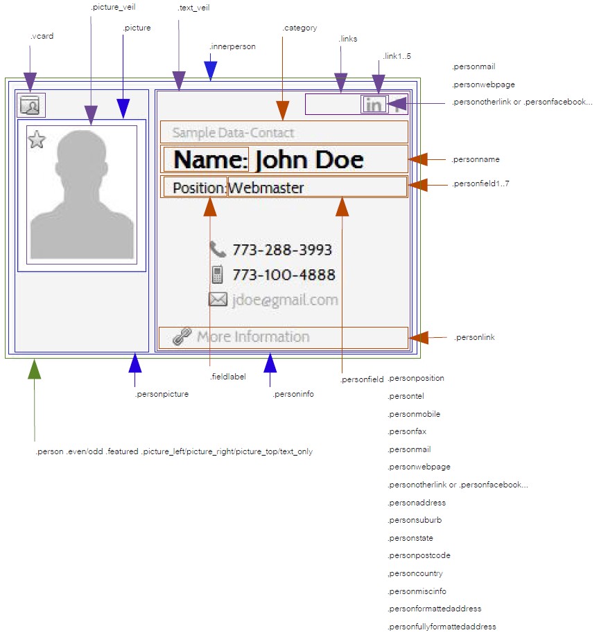
Following is the annoted representation of a card for a basic knowledge of the classes available for the presentation of a contact:
Anatomy of a contact's card

Further explanations
There are several "building blocks" used in the creation of the card.
The 2 main ones are .personpicture and .personinfo. They determine where the contact's picture will show relatively to the contact's information. Two "floating" blocks (.vcard and .links) give even more flexibility by adding a way of downloading a vcard version of the contact's information and by allowing specific links to be independant from the remaining information. Any of those blocks can have a specific position on the card depending on the picture's position (or if no picture is showing).
Rules and other considerations
There are a few rules when creating a card, depending on the selected parameters for the component or module:
- if the card is of type 'picture only', the blocks
.personnameand.categoryare the only contact's fields shown, all other elements remaining available, - if the contact's links a thru e are social links (Facebook, LinkedIn...), they are recognized automatically by the system and the proper icons will show IF the icons exist in the icon pack selected.
Icon packs
Several icon sets are already available in the Trombinoscope Extended edition. Nevertheless, you can add you own icons.
Find 'com_trombinoscopeextended' under 'components', then 'assets' and 'icons'. Add your own folder and put your icons into it. Make sure your icons have the proper naming. If you add your own social icons, create a sub-directory called 'social' and put your icons into it. For an example, look under the 'original' directory. You must do the same for the module in order to have your own icons available for the modules. Find 'mod_trombinoscopeextended' under 'modules', then 'icons'.
Once created, the folder name you chose will show in your component or module parameter selections automatically.
When putting together your icon pack, you will need the following icons:
- phone: con_tel.png
- mobile: con_mobile.png
- fax: con_fax.png
- email: con_email.png
- website: con_weblink.png
- address: con_home.png
- miscellaneous information: con_info.png
- link to the contact: con_link.png
- featured: con_featured.png
- vcard: con_vcard.png
- download: con_download.png
- and optionally: Facebook (facebook.png) ...
Download
Please feel free to download the following theme and use it as a template/example in the creation of your own theme. You will have to replace 'theme' in the files and the file names with your own theme name. This packaging will allow you to install your theme as any other Joomla! extension and maybe share it with the rest of the community.
As for the icon packs, you can add your theme manually for the component and the module by creating your own sub-directory in the 'themes' folders. For an example, look under the 'original' directory.

