
Several themes are packaged with the component to get you started but other ones can be downloaded from this website.
| T Trombinoscope view M Module C Contact view | T | M | C | |
 |
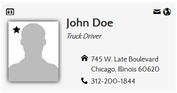
Original This is the default theme |
X | X | X |
 |
Picture Background Included in 3.0 Separate download (previous versions) CCS3/flexbox theme allowing a second unique picture as background. For additional information about this theme, check the article Introducing the Picture Background theme for Trombinoscope Contacts |
X | X | - |
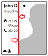 |
Slide Blinds (Picture Slide) Slide the picture on hover to reveal contact information. Requirements
|
X | X | - |
 |
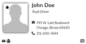
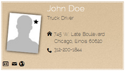
Theme 1 Removed in 3.0 White border. Left margin for fields 2 to 7 |
X | X | X |
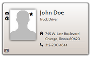 |
Theme 2 Not for 3.0 Separate download (previous versions) Card with round corners and shadow. Lines between fields |
X | X | X |
 |
Theme 3 Not for 3.0 Separate download (previous versions) Rotated picture. Embedded font applied to the text. Note The picture rotation is not compatible with picture hover animations |
X | X | X |
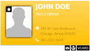 |
Theme 4 (Canary) Separate download Embedded font applied to the name. Links as icons only are located outside the card. Lines between fields are using the card’s second background color |
X | X | X |