
These parameters take care of the specificities of the information blocs.
| Under theming in v4.9 Font size |
The font size in comparison to the font size of reference |
| Under theming in v4.9 Font |
The font for the blocs of information |
| Separator | The symbol/text that separates each bloc of information. Blank space allowed. 2 consecutives spaces are considered one space |
| Under theming in v4.9 Icons color |
The color of the icons when shown. The icons are selected from an icon font |
Information block
| Removed from Pro v4.9+ Position |
Where to put this information compared to the text |
Information over head/block before title/after title/before text/after text
The information details for the article item.
Information over head: will add the information over image and video heads only. In themes where the text is over the head (like for Overlap), information from that section will not show.
| Information (free 5 fields Pro 9 fields Pro for Joomla 3.8+ unlimited) | |
|---|---|
| Show icon | A possible icon to precede the text |
| Free v7.0 Pro Icon |
Select an icon that will override the default one |
| Prepend text | The text that can be optionally prepended to the information
Example Add |
| Type | The type of information to show
|
| Append new line | Creates a new line after the selected information |
| Free v7.0 Pro Access |
The access level group allowed to see that information |
| Layout | An alternate layout to apply to the field (in most cases, use 'Default') - the layouts are found in the extension's layout overrides in all templates |
Information block (inline items)
The information details for the item that shows inline (below the list of the module items).
| Information : 3 fields |
|---|
Note These will show before the item's text
Warning You cannot use: read more, share icons and all comments types
Selected information specifics
| Multilingual Associations | |||||||
|---|---|---|---|---|---|---|---|
| Association Representation | What style is used to represent the associations
|
||||||
| Date | |||||||
| Removed from Pro v4+ Show |
The way the date will be presented
|
||||||
| Date format | The date format following the syntax explained at http://php.net/manual/en/function.date.php | ||||||
| Time | |||||||
| Time format | The time format following the syntax explained at http://php.net/manual/en/function.date.php | ||||||
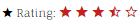
| Rating/Vote | |||||||
| Style | The way the vote system will show
|
||||||
| Star color | The color for the stars | ||||||
| Examples
|
|||||||
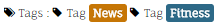
| Pro Tags | |||||||
| Order | The tags order
|
||||||
| Hide tags | Tags that should not show in the list of tags | ||||||
| Distinct | Show the tags as distinct entities, allowing for more complex skinning. Otherwise, the tags will show as a comma separated list | ||||||
| Show icon | When distincts, show an icon before each tag | ||||||
| Icon | Which icon to show. If there is no selection, it will use the default icon | ||||||
| Prepend text | Text to show before each distinct tag | ||||||
| Use tag classes | Skin the distinct tags with classes that are set for each tag in the core Tagscomponent (does not apply to K2) |
||||||
| Classes | Optional CSS classes to apply to all tags | ||||||
Examples
|
|||||||
| Pro Links | |||||||
| Show icon | Show an icon before each link | ||||||
| Icon | Which icon to show. If there is no selection, it will use the default icon | ||||||
| Prepend text | Text to show before each link | ||||||
| Protocol | Show or hide the http:// or https:// | ||||||
| Example
|
|||||||
| Pro Sharing - the share links to show when using the information type 'Share icons' | |||||||
| Color | Give the share icons their official color
|
||||||
| Size | The size of the icons (width and height are identical, set in px and em) | ||||||
| Radius | The radius when there is a background (allowing the icons to have a rounded look) | ||||||
| Classes | Optional CSS classes to apply to each square icon
Example |
||||||
| Pro v4.10- Include (6 items) |
Select which share service to show. The order in which the selections are made will determine the order on the site
|
||||||
| Pro v4.11+ Share buttons |
Unlimited set of share buttons you can dynamically order
All icons use the SVG format. Originals have been downloaded from fontawesome.com and are licensed under the Creative Commons Attribution 4.0 International license |
||||||
| Removed from Pro v4+ Use deprecated |
Use the old way to select share services (the following parameters). This is available for backward compatibility with older versions. The following parameters will be removed in the next major release of the module. Therefore, select the share services in the new 'include' parameters instead, allowing ordering of the icons | ||||||
| Removed from Pro v4+ |
Select to show an email icon | ||||||
| Removed from Pro v4+ Facebook, Google+, Twitter, LinkedIn, Stumbleupon |
Select to show the targeted social media Warning Share links are not available if the item link is unauthorized |
||||||
Examples
|
|||||||
 distinct tags using each tag associated CSS classes
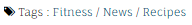 tag list with override of the separator
 background with radius of 10px
 extra classes btn btn-small
 color
colorAdditional information on specific types
Hits
It is possible to change the output text by overriding the constant key MOD_LATESTNEWSENHANCEDEXTENDED_HITS with language overrides.
It defaults, in English, to %s hit(s)
where %s
is the hit count for the item.
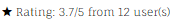
Rating
You can also modify the rating outputs by overriding the keys:MOD_LATESTNEWSENHANCEDEXTENDED_NORATING (which defaults to No rating
),MOD_LATESTNEWSENHANCEDEXTENDED_RATING (which defaults to %s/5
where %s
is the actual rating),MOD_LATESTNEWSENHANCEDEXTENDED_FROMUSERS (which defaults to from %s user(s)
where %s
is the number of users who rated the item).
Tags
Override the key MOD_LATESTNEWSENHANCEDEXTENDED_TAGSSEPARATOR to change the symbol used to separate the tags when showing as comma-separated list.
K2 comments, JComments
The constant key MOD_LATESTNEWSENHANCEDEXTENDED_COMMENTS can be overridden.
The English default is %s comments
where %s
is the number of comments associated with the item.
Comments cannot be linked if the item link is unauthorized (inaccessible without login)