
Pro
A killer feature for Truly Responsive Slides Pro
is the ability to add tooltips to slides.
This is made possible thanks to two additional plugins (the content plugin Slide Tooltips
when using articles as data source or the K2 plugin Slide Tooltips
when using K2 items as data).
Once the desired plugin enabled, new fields appear either in articles or K2 items:
- in articles: fields show in the before v2.2 Images and Links tab or in the starting in v2.2 Tooltips tab,
- in K2 items: fields show in the Extra Fields tab.
For each individual tooltip, set:
| top | The top coordinate of the tooltip target | ||||||||
| left | The left coordinate of the tooltip target | ||||||||
| article/item | The article/item used as content for the tooltip. New 2.5 The { field } syntax is now supported in tooltips (when tooltips are articles ONLY). You can include custom fields in the content and their value will show in place. |
||||||||
| title | The tooltip title, when not using an article or K2 item as tooltip. Inline HTML tags are allowed | ||||||||
| content | The tooltip content, when not using an article or K2 item as tooltip. Inline HTML tags are allowed | ||||||||
| placement | The position of the tooltip in comparison to its target. Note In Bootstrap 4, the placement may change if the room for showing the tooltip is insufficient.
|
||||||||
| trigger | The way the tooltip is triggered in the slide
|
The target coordinates are calculated from the original image width and height (BEFORE it is resized to fit the slider). In order to avoid confusion as much as possible, it is better to make sure that original images are already the size of the final slider.
For instance, if the image is of width 1024 pixels and height 768 pixels, the target top and left coordinates are calculated as follow:
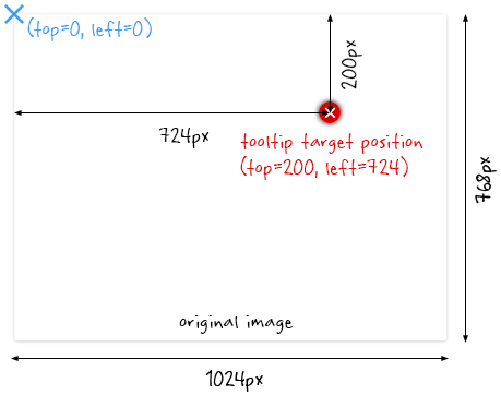
The target will get the correct position, no matter how the slider is resized (the position is calculated in percentages of the image size internally).
A top value of 0 and/or a left value of 0 will not show any tooltip. You need to start values at 1.
The tooltips are not subject to caption restrictions (they can be placed anywhere on top of the image). However, when using the slider with the auto-hide carousel of thumbnails, if the tooltip target is placed under the carousel when it is in full view, it won't be clickable, even if the carousel is hidden (that lower part of the slideshow is reserved for user input, to show and hide the carousel of thumbnails).
The tooltip content
Tooltips are Bootstrap popovers, therefore they need Bootstrap to function.
If your template is not using Bootstrap, set the Bootstrap compatibility of the extension to Joomla. This will ensure that Bootstrap, packaged with the Joomla core, will be loaded on pages where the slideshow is used.
Each tooltip is an article or K2 item, therefore it is good practice to place them into a separate category so they do not interfere with the slides themselves.
New v1.10 Starting with version 1.10 of the extension, tooltips can also be created directly in the slides, eliminating the need for creating additional articles or K2 items representing them.
When using articles or K2 items as tooltips, It is possible to hide the tooltip title by setting the ‘show title’ article/k2 item option to ‘hide’.
Titles are <h3> tags. They will take the styling of the template.
Bootstrap sets the popover width to 276 pixels maximum. Popover width is handled automatically depending on its content. But this does not always give the best output representation. It is best to manually ‘break’ lines in the content with \n in order to force the best display possible.
Why \n and not just a <br /> tag? For best representation when tooltips show below the slideshow on smaller devices. The \n is stripped out then and does not 'break' the output.
Example (before v10) In the article/K2 item content:
Holisticly embrace extensible models\nafter world-class ideas.
Example (starting with v10) In the content field:
Holisticly embrace extensible models\nafter world-class ideas.
Moreover, when too long, the tooltip titles are truncated by default (you cannot go over the 276 pixels maximum width).
Prior to v10 To handle long titles (or simply show more sophisticated titles with inline html tags), best is to add the title to the content (as an h3 html header), hide the title (article or k2 item option) and break with \n.
Starting with v10 Use the new title field where you can add inline html tags and break with \n.
Example (before v10) Add to the article/K2 item content (code view):
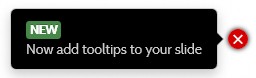
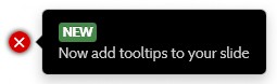
<h3><span class="label">New</span> This is a long title\nwith a break</h3>
<p>This is the content of the tooltip.</p>
Example (starting with v10) Add to the title field:
<span class="label">New</span> This is a long title\nwith a break
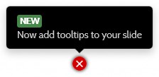
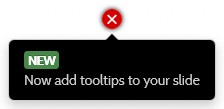
Tooltips will not show on viewports smaller than 640 pixels wide. Instead, they will appear under the slideshow, one slide at a time. The target icons are replaced with numbers for convenience to the user. It is possible to style the tooltips' container by using the CSS class
parameter in the mobile section of the Slides
tab. That container is used for both content and tooltips (see The list of options
-> Slides section).
On a large device: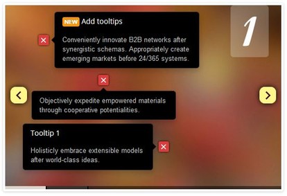
On a small device: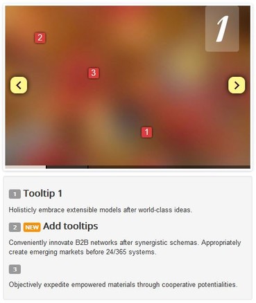
- It is possible to show larger tooltips (by overriding the max-width property of the popover), but it is better to refrain from it. It may cause erratic behaviors.
- There is no support for plugin triggers inside the tooltip.
- Although html can be included into the tooltip content, the Bootstrap popover component cannot handle highly complex content. Content is 'sanitized'.
Tags allowed:
a,area,b,br,col,code,div,em,hr,h1-6,i,img,li,ol,p,pre,s,small,span,sub,sup,strong,u,ul