| General options | |||||||||||||
|---|---|---|---|---|---|---|---|---|---|---|---|---|---|
| 2.0 Space to border |
Space between header content and the sides of the framework or set the content to align with the sides | ||||||||||||
| 2.0 Gap above brand |
Space above the logo and/or site title | ||||||||||||
| 2.0 Gap below brand |
Space below the logo and/or site title | ||||||||||||
| 2.0 Brand spacing |
Spacing of the logo and/or title horizontally
|
||||||||||||
| Site | |||||||||||||
| Title | The title of the site (always present in the code for crawlers) The title can contain html code, making it easier to skin |
||||||||||||
| Slogan | The site's slogan | ||||||||||||
| Description | The site's description | ||||||||||||
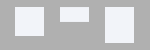
| 2.0 Text alignment |
The text alignment.
|
||||||||||||
| Logo | |||||||||||||
| Replace title | Whether or not the title is replaced by the logo. The title remains visible to search engines no matter the selection | ||||||||||||
| Link | An optional link to give to the logo (like the home page for instance)/, /index.php, /fr are valid links |
||||||||||||
| 2.0 Logo |
The logo for the website. It must be the largest version of the logo that you have (at normal resolution). For instance, logo.png. |
||||||||||||
| 2.0 Fixed sizes |
On fixed size, the logo resizes according to media query breakpoints. Otherwise, resizing will be responsive | ||||||||||||
| 2.0 Breakpoints |
Breakpoints are used to adjust the size of the logo to match the screen width of the device it is being viewed on. Add as many breakpoints as needed. The image width must be smaller than the breakpoint width. Breakpoints MUST be sorted from largest to smallest.
For instance, let's say you have 3 images for the logo. The largest image is logo.png, set previously in the 'Logo' parameter. It has size 500x61.We will have 2 breakpoints. One at 480 pixels, one at 800 pixels. This means that we need an image for screen sizes 0 to 480 pixels, an image for screen sizes 481 pixels to 800 pixels. For sizes larger than 800 pixels, the 'Logo' will be used. In that case, we will create 2 breakpoints (largest first): - breakpoint: 800px with width 400px and height 49px - breakpoint: 480px with width 246px and height 30px logo_480.png (of size 246x30) and logo_800.png (of size 400x49) must exist in the same folder as logo.png. |
||||||||||||
| 2.0 High resolution |
All logo images can have a corresponding high-resolution image. High resolution images are not created automatically. You need to create a high-resolution image for your logo image(s) manually. Add @2x to the file name of the image. High resolution images are twice the size of the original image. For instance, if the logo is logo.png with size 100x50, then the corresponding high-resolution image is [email protected] with size 200x100 |
||||||||||||
| Small logo | |||||||||||||
| 1.3 Small |
The image to use as the smallest version of the logo (mobile first) | ||||||||||||
| 1.3 Width |
The width of the image | ||||||||||||
| 1.3 Height |
The height of the image | ||||||||||||
| 1.3 Small (high resolution) |
The image to use on high pixel ratio screens (needs to be twice the size of the original small image). It will ensure logos remain crisp on high resolution screens, like retina displays | ||||||||||||
| Medium logo | |||||||||||||
| 1.3 Breakpoint |
The minimum screen size required for the medium logo to show | ||||||||||||
| 1.3 Medium |
The image to use as the medium version of the logo | ||||||||||||
| 1.3 Width |
The width of the image | ||||||||||||
| 1.3 Height |
The height of the image | ||||||||||||
| 1.3 Medium (high resolution) |
The image to use on high pixel ratio screens (needs to be twice the size of the original medium image). It will ensure logos remain crisp on high resolution screens, like retina displays | ||||||||||||
| Large logo | |||||||||||||
| 1.3 Breakpoint |
The minimum screen size required for the large logo to show | ||||||||||||
| 1.3 Large |
The image to use as the large version of the logo | ||||||||||||
| 1.3 Width |
The width of the image | ||||||||||||
| 1.3 Height |
The height of the image | ||||||||||||
| 1.3 Large (high resolution) |
The image to use on high pixel ratio screens (needs to be twice the size of the original large image). It will ensure logos remain crisp on high resolution screens, like retina displays | ||||||||||||
| Main menu | |||||||||||||
| Fixed on Scroll | Will pin the main menu at the top of the screen when visitors scroll down the page | ||||||||||||
| Include Logo | The logo will be part of the main menu and not a separate entity | ||||||||||||
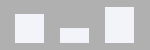
| Menu spacing | Aligns the menu horizontally.
|
||||||||||||
| Menu Alignment | Aligns the menu vertically.
|
||||||||||||
- Details
- Category: Bare 960 Responsive
Header
- Information
- Bare 960 Responsive


Related tutorials and topics
General Menu
Commercial Extensions
Free Templates
Free Extensions
Keep in touch

Simplify Your Web is not affiliated with or endorsed by The Joomla! Project™ or Open Source Matters.
The Joomla!® name and logo is used under a limited license granted by Open Source Matters the trademark holder in the United States and other countries.