Each card style has its own properties and you may want to experiment which style best fits your design needs.
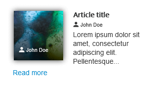
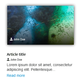
Original
For head types: image calendar icon video
This is a multi-purpose style that will fit most situations and can be used with any 'head' type. The 'head' can be positioned at the top, left or right of the body content. The body can wrap around the head.
When the head type is 'image'
This style works best with small image sizes. When using larger images and positioning the image on the right or on the left of the body content, some CSS tweaks may be necessary to improve the responsiveness of the layout (see the article Tip: fixing an un-responsive layout in Latest News Enhanced for Joomla)
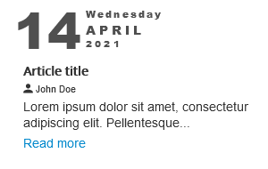
When the head type is 'calendar'
When the head type is 'icon'
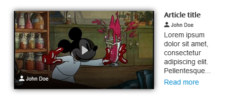
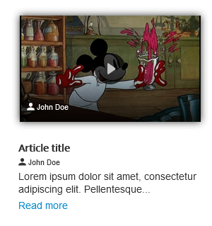
When the head type is 'video'
Like for images, when using large videos, you may need to tweak the CSS to improve the layout (when using positions left and right).
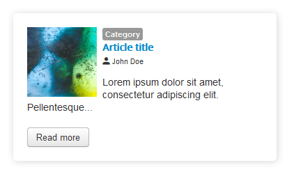
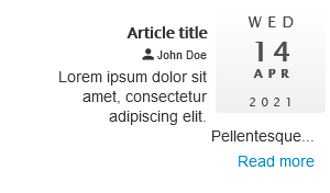
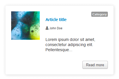
Original (modern)
For head types: image calendar icon video
This is a multi-purpose style that will fit most situations and can be used with any 'head' type. Elements composing the card are laid out with Flexbox and there is more white space between them. The head can be positioned at the top, bottom, left or right of the body content. The body CANNOT wrap around the head (in left and right positions). However, when space is lacking, the whole body content will move below the head. Head types are treated similarly to the original theme.
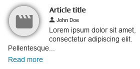
Full Width
For head types: image calendar icon video
This style can be used with any 'head' type. The particularity of this style is that the body of the card will not grow larger than the 'head' (when the head type is an image or a video). The 'head' is always above or below the content of the body (use head position 'top' or 'bottom').
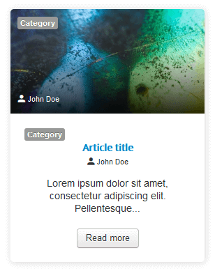
When the head type is 'image'
The body content is as wide as the image.
When the head type is 'calendar'
The body content is not restricted to the size of the head. By default, the calendar is centered at the top or bottom of the card.
When the head type is 'icon'
The body content is not restricted to the size of the head. By default, the icon is centered at the top or bottom of the card.
When the head type is 'video'
The body content is as wide as the video.
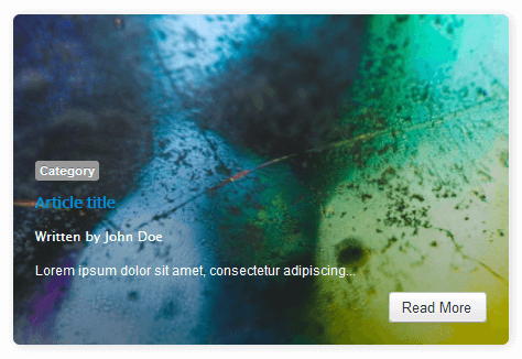
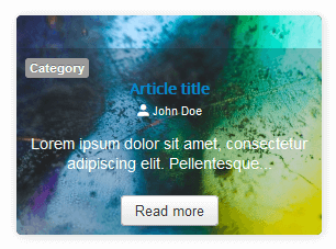
Overlap
For head type: image
This style can be used with the image 'head' type ONLY. The text content is placed over the image. The 'head' width dictates the size of the card. However, it can resize down. The text can be placed at all cardinal points (side left, side right, top or bottom - use the head position parameter for that purpose). The text has a semi-transparent background to improve readability. When lacking space, the text will be scrollable. To avoid that, keep the content minimal and use a minimum item width that 'makes sense'.
A good starting point when designing with this style is to have item max-width equal to head width.
Flexi Cover
For head type: image
This style can be used with the image 'head' type ONLY. The text content is placed over the image. The content dictates the size of the card. The image grows if the image dimensions are smaller than the card size (using the CSS property object-fit: cover).
The text can be pinned to the top or the bottom of the card (use the head position parameter for that purpose). The whole image is covered with a semi-transparent gradient to improve text readability.