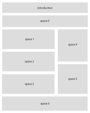
| Introduction | Space available as introduction to the remaining layout. It has the same element selection found in spaces 0 .. 6 |
| Space 0 .. 6 | The spaces available for contact page building blocks. Choose from:
The custom fields of repeatable type or subform type are represented as a table (each column is a field). You can use CSS or template overrides for a modified look or different representation of the data. Note modules can be loaded through plugins such as the |
| Label 0 .. 6 | The label used for the selected space. Most useful when printing. Defaults to the translated selected element. Note For multi-language websites, if one contact is used for all languages, use a unique uppercased name (for instance SPACE_SPACE0_LABEL and use language overrides to translate it) |
| Column width | When the layout contains columns, the width (in percentages) taken by the first column |
| Removed in v3.0 Min card width |
The minimum width in pixels where the card stops shrinking in its container. If the picture is on the side of the text (landscape mode), it will turn into portrait mode (text under the picture). Perfect for responsive environments. Note The card takes 100% of its container width |


