Overall
| Alternative layout | Use a different layout from the supplied module or overrides in the templates | ||||||||||||
| Configuration | The overall layout of the output.
|
||||||||||||
| Items spacing (grid) | In grid configuration, the way items are spaced in relation to each other
|
||||||||||||
| Items alignment (grid) | In grid configuration, the alignment of the items
|
||||||||||||
| Items alignment (list) | In list configuration, the alignment of the items
|
||||||||||||
| Layout | The module template to use (includes overrides). Hot Use nologos to use the module without logos |
||||||||||||
| Footnote | |||||||||||||
|---|---|---|---|---|---|---|---|---|---|---|---|---|---|
| Footnote | Add a footnote at the bottom of the module (for credentials for instance) | ||||||||||||


Item
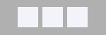
| Overall width (px) | The max width of each element in pixels. Before v4.0 Leave blank in grid configuration to use the logo width as default. Leave blank in list configuration to use the container's width. Starting with v4.0 Leave blank to fit to content. Example of items having a max width, taking the size of its content:  |
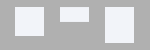
| Exact width | When set to 'yes', the items won't resize. Otherwise, the items can get smaller than the overall width, depending on their content and container Set to 'no' for improved carousel support (the carousel needs to be able to set its own widths). Example of forcing items to be of an exact width:  |
| Top margin (px) | The top margin for the item |
| Right margin (px) | The right margin for the item |
| Bottom margin (px) | The bottom margin for the item |
| Left margin (px) | The left margin for the item |
| Moved to styling tab Background color |
The color of the background for each item |
| Moved to styling tab Font size |
The font size for the text (100% will keep the size of the template's original size) |
| Logo | |
|---|---|
| Logo tooltip | Show or hide the tooltip on the logo |
| Caption | Show the links’ caption (caption of the first image by default, title otherwise). The second image data is not taken into account |
| CSS classes | The CSS classes to add to the caption
Example |
| Text | |
| Alignment (grid) | In grid view, align the text:
|
| Alignment (list) | In list view, vertically align the text:
|
| Spacing | The amount of space between elements (image <-> text) |
| Wrap (list) | Moves the text below the image when there is not enough room to have image and text side by side |
| Title | Display the item's title |
| HTML header tag | The HTML tag to apply to the title (h1, .. h6) |
| Link title | Make the title clickable |
| Hits | Show the number of hits |
| CSS classes | The CSS classes to add to the hits
Example |
| Hit feedback | Adds a ‘clicked’ CSS class to the hit item (via jQuery) Before 3.0 When enabling that feature in a module instance, it makes it available to all other instances on the page |
| Text separator | The symbol/text to separate information |
| Description | Show the description of the link or not |
| Letter count max | The maximum number of letters of the description to show (leave empty to show everything) |
| Truncate last word | When the text is truncated, it is possible to leave the last word intact or allow it to be truncated to get closer to the letter count max |
| Strip tags | Leave the html formatting or not |
| Keep tags | Select which tags to keep when stripping tags (no ‘end’ tags necessary) |
| Trigger events | Trigger 'onContentPrepare' events from the description. 'No' ignores the calls and removes the plugins syntax |
| HTML tag wrapper | The HTML tag to use to wrap the description of the item (choose from div, p, span, q, dfn) |