
| Visible items | The items that are visible at one time |
Animation
| Type |
|
||||||||||||
| Direction | The direction of the transformation (if the animation allows for it).
|
||||||||||||
| Auto start | Starts the animation automatically or waits for user interaction | ||||||||||||
| Speed | The time spent by the transformation (ms) | ||||||||||||
| Interval | The time between 2 transformations (ms) | ||||||||||||
| Move | Animate one item or all at a time | ||||||||||||


If you experience 'weird' behavior in the way items slide, adding a max-width to the items will most likely improve scrolling.
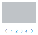
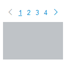
Pagination
| Type | The pagination style
|
||||||||||
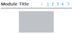
| Positioning | The position of the pagination compared to the items or the module title
|
||||||||||
| Alignment | The alignment of the pagination (for all except the 'around' horizontal configuration) | ||||||||||
| Style | The pagination look (default is an un-skinned look). Use 'Bootstrap' to match any Bootstrap-based template |
||||||||||
| Size | The size of the pagination (relative to Bootstrap)
|
||||||||||
| (Specific) Size | The size of the pagination relative to the font size of reference (when style is set to 'default') | ||||||||||
| Offset | The distance between the news items and the pagination Note when using the horizontal configuration and the 'Around' positioning, this is the distance from the top |
||||||||||
| Prev/Next types | Choose from arrow, Joomla translation (can be overridden) or your own label | ||||||||||
| Prev/Next labels | The labels for the previous and next links | ||||||||||
| Links to display | The number maximum of page links to show at a time (limits the number of pages to show when there are a lot of them) | ||||||||||
| Pro Title syntax |
The syntax to use when showing the pagination at the module title level |


Pro
Title syntax
When showing the pagination at the title level, the original module title is hidden and replaced by the HTML code specified in the ‘title syntax’ field. Usually, this code must match the original template module title layout (found in the file html/modules.php of the template used).
{headertag} |
The header tag found in the advanced options |
{headerclass} |
The header class found in the advanced options |
{title} |
This is the module title |
{pagination} |
This represents the pagination block |
Most likely some CSS tweaking will be required to match your requirements.
Example<div class="{headerclass}">
<{headertag}>{title}</{headertag}>{pagination}
</div>
Example<div class="myclass">
<h4>{title}</h4>{pagination}
</div>