
Pro
Parameters related to tooltips added to slides (does not apply to slides created from images only).
Check the section Tooltips
for more information.
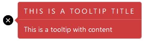
- The cross inside the circle is called 'the target',
- The tooltip itself is composed of a title and a content block. The line in between is called 'the separator'.
When using tooltips, Bootstrap is required.
| Target | |
|---|---|
| Icon | The target the tooltip points to. Check which icons are available New 2.5 Joomla 4 Font Awesome icons are now supported |
| Icon size | The size of the icon |
| Icon color | The color of the icon |
| Background color | The background color of the icon |
| Radius | The radius of the icon background (0 for a square background, 10 for a round one) |
| Shadow | The shadow for the target |
| Pulse animation | A little CSS3 animation that attracts user attention |
| Tooltip | |
| Text color | Set the color of the text in the tooltips |
| Background color | Set the background color of the tooltips |
| Separator | Show or hide a separator between the title and the content of the tooltips. The separator color is the color as the text color, but with low opacity |
The tooltip title is a h3 header tag. It may reflect the h3 styling of your template.