
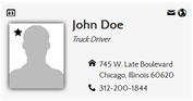
| Theme | The overall look of a contact card
|
||||||||||
 Download more themes
Theme overrides
Tweak the themes with a few additional options.
| Style Social Links | Add the official color to social icons (e.g. blue for Facebook...), overriding the icon color | ||||||||||||||
| Card | |||||||||||||||
|---|---|---|---|---|---|---|---|---|---|---|---|---|---|---|---|
| Background image | Card background image (has precedence over the background color overrides) | ||||||||||||||
| Background color | Card background color (overrides the theme’s background color) Leave blank to keep the theme’s original color |
||||||||||||||
| Background color 2 | 2nd background color to create gradients. Leave blank to keep the theme’s original color |
||||||||||||||
| Shadow | The item's shadow
|
||||||||||||||
| Border radius | The card border radius | ||||||||||||||
| Border width | The card border width | ||||||||||||||
| Border color | The card border color | ||||||||||||||
| Font | The font to use for the card. Joomla 4 The extension supports the GDPR-compliant web fonts from fonts.bunny.net. To select the service (Google is the default), go to the SimplifyYourWeb extensions System plugin and select the web font service you wish to use. |
||||||||||||||
| Font size reference | The font size the whole card is based on (in pixels) | ||||||||||||||
| Font color | The overall text color Leave blank to keep the theme’s original color |
||||||||||||||
| Line spacing | The line height for all fields | ||||||||||||||
| Fields | |||||||||||||||
| Icon font size | The icon font size (in em). Relative to the font size reference | ||||||||||||||
| Icon font color | Choose the icon color to use | ||||||||||||||
| Icon font background color | The background color of the icon | ||||||||||||||
| Label width | Possible label width to allow all labels to have the same size (in pixels) so that information remains aligned A value of 0 will show information immediately following the label |
||||||||||||||
| Label color | The color of the label | ||||||||||||||
| Label background color | The background color of the label | ||||||||||||||
| Links | |||||||||||||||
| Links position | The position of the links on the card.
|
||||||||||||||
| Icon font size | The icon font size (in em). Relative to the font size of the card | ||||||||||||||
| Icon font color | The color of the icon | ||||||||||||||
| Icon font background color | The background color of the icon | ||||||||||||||
| Other | |||||||||||||||
| Additional CSS | An easy way to include additional styles
Example |
||||||||||||||